Saturday, January 30, 2021

Average True Range

Average True Range (ATR) is an indicator of the market’s volatility. It shows how much an asset moves, on average, over a given time frame. In other words, it helps to determine the average size of the daily trading range. The indicator was developed by J. Welles Wilder Jr. in his book, New Concepts in Technical Trading Systems.


About ATR indicator

The indicator is calculated on the basis of the so-called true ranges. It uses the absolute value of the current high less the previous close or the absolute value of the current low less the previous close. The ATR represents a moving average of these ranges.

ATR rises when trading is more volatile (price bars are long) and falls during periods of low volatility (price bars are short). The ATR is often used to determine the best position for stop-loss orders.


How to implement

The ATR belongs to the default set of MetaTrader. You can add it to the chart by clicking “Insert” – “Indicators” – “Oscillator” and then choosing “ATR”.

By default, MetaTrader will offer you to have “14” as the number of periods. If you choose a smaller number, the indicator will generate more trading signals, although the number of false signals will also increase. If you opt for a bigger number, the number of trading signals will likely decline.

ATR can be used on any timeframe that is bigger than H1.


How to interpret

As we pointed out before, the Average True Range has two important applications. Let’s delve into them.

Notice that in Metatrader, the indicator will show pips, so the ATR reading of 0.0025 means 25 pips.


Using ATR as a filter in trading

The indicator can be used as a filter of a trend. The higher the value of the indicator is, the higher the probability of a trend’s change is. The lower the indicator’s value is, the weaker the trend’s movement is.

To analyze trends with ATR you will need a central line. When the indicator breaks it, the most significant moves of the market take place. There is no particular central line for this indicator, so it is estimated by the eye. As an option, you can use a moving average with a big period like 100. To do this, choose “Moving Average” among MT4’s trend indicators in the “Navigator” panel, and then drag and drop it into the ATR indicator chart. In the window that pops up, choose “First Indicator’s Data” from the “Apply to” dropdown menu of the “Parameters” tab.

When the indicator is below the moving average, the market is calm. When the ATR breaks the moving average, a trend starts.


To confirm the trend, it is worth to implement the indicator on several time frames, for example, on D1 and H1. If they move in the same direction and the ATR line breaks its moving average on the smaller time frame, it means that the market becomes animated.

It’s also a good idea to apply the indicator Envelopes to ATR. The logic is the same. If the latter is below the Envelopes’ lines, volatility is low. A break to the upside signals that the price action has become more intense. 

Finally, the ATR can tell you whether there’s a sense to trade. If the indicator value is bigger than, let’s say, 20, the market is probably experiencing some extreme conditions. Usually, this happens when an important piece of news is out. If the ATR reading is smaller than 10, the price probably staggers, the candlesticks are small and hence the profit potential is limited. If you see that the market has already made a move equal to or exceeding daily ATR, the odds are that it won’t move much in that direction during the same day. As a result, it’s probably not the best time to bet on the continuation of the movement. On the contrary, there may be sensible to look for the signals in the opposite direction.


Using ATR to exit the market.

The ATR helps traders to set stop-loss orders that take into account market volatility. That applies both for static and trailing stop-loss orders.

When the market is volatile, one should set wider stops in order to avoid being stopped out of the trading by some random market noise. When the volatility is low, one may set tighter stops. It’s recommended to set stops equal to 1-4 times of ATR value.


As for trailing stops, you place a stop loss at 2 x ATR below the entry price if buying, or 2 x ATR above the entry price if shorting. There’s also a so-called “chandelier exit” when a stop loss is placed under the highest high the price reached since you entered the buy trade. The distance between the highest high and the stop level is defined as some multiple times the ATR. For example, we can subtract three times the value of the ATR from the highest high since we entered the trade.


Conclusion.

ATR is commonly used in creating automated trading systems. It helps to build filters that take into account volatility or adapt different variables to the market. Those who trade manually often underestimate the benefits of the Average True Range indicator. Yet, it can do your trading a lot of good by making it more precise.

Commodity Channel Index

Commodity Channel Index (CCI) is a technical indicator developed by Donald Lambert in 1980. It shows when the market is overbought/oversold and helps to assess the direction and the strength of a trend as well as spot new trends.  


How to implement CCI

The CCI is included in the MetaTrader default indicator kit, so you don’t need to download it. Go to “Insert”, find “Indicators” and then “Oscillators” – and you will see the Commodity Channel Index. The indicator will appear in a separate window below the price chart.

The indicator’s dynamics depends on the number of periods that were used to form it. The smaller the period, the more volatile will be the indicator and the more time it will spend outside of the ±100 range. By default, MetaTrader proposes “14” as the CCI period. Another popular setting is 20 periods.


How to interpret

CCI measures the difference between the current price and the historical average price. The indicator oscillates across a center line. When it is above zero, it means that the price is above the historic average. Consequently, when it is below zero, the price is below the historic average. 

Overbought/oversold conditions. As you can see, the levels of +100 and -100 are marked in the CCI chart. If the indicator rises above +100, it means the pair is overbought and the possibility of a downward correction has increased. When CCI reverses down from positive or near-zero readings and makes its way to -100, it points to an emerging downtrend.

A decline below -100 means the downtrend had been strong and the market became oversold. When CCI turns up from negative near-zero readings and starts moving toward +100, it’s a sign of an emerging uptrend.

Notice that the indicator doesn’t have an upside or a downside limit as such, although it will always tend to return to the median 0 level. As a result, it’s necessary to look to past readings of the indicator to get a sense of where price reversed. This necessity to interpret things makes the indicator somewhat subjective. 


Divergence/Convergence. Divergence occurs when price forms a higher maximum but CCI forms a lower one. It can be confirmed by a break of CCI below zero or a break of support on the price chart. Conversely, convergence occurs when the price forms a lower low but CCI forms a higher low. It can be confirmed by a CCI break above zero or a break of resistance on the price chart.


Conclusion 

As any other technical indicator, CCI has its drawbacks. Apart from the subjectivity we mentioned earlier, it’s necessary to point out that the indicator is lagging behind the price. As a result, the signals may turn up too late and thus be false. To solve this problem, use CCI together with the analysis of price action as well as with other technical indicators that will confirm or reject its signals.

Friday, January 29, 2021

Bollinger bands

The Bollinger bands (BB) is a classic trend indicator developed by John Bollinger. His book Bollinger on Bollinger Bands contains a detailed description of how to use it on its own as well as with other tools of technical analysis. BB is very popular among traders all over the world. It is a type of statistical chart characterizing the prices and volatility over time of a financial instrument or commodity, using a formulaic method.


About Bollinger bands

The indicator consists of 3 lines  – a middle band and two outer ones. The middle band is a simple moving average, usually with the period of 20. The outer bands are usually set 2 standard deviations above and below the middle band.

The Bollinger bands have something in common with the Envelopes indicator. The difference is that the borders of Envelopes are situated above and below the moving average at the fixed distance in %, while the borders of the Bollinger bands are calculated on the basis of the constantly changing standard deviation.


How to implement

The Bollinger Bands belongs to the default set of MetaTrader. You can add it to the chart by clicking “Insert” – “Indicators” – “Trend” and then choosing “Bollinger bands”.

MT will offer you 20 as period and 2 for deviation. You can change these parameters if you want to. It’s recommended to use periods from 13 to 24, while the deviation should be in the range between 2 and 5. For example, it’s possible to use 50 and 2.1 for longer timeframes and 10 and 1.9 shorter timeframes. Notice that the smaller the period, the more trading opportunities will be offered by the indicator. The number of false signals, however, will be greater as well. At the same time, when the period is big, the indicator becomes less sensitive. This is not suitable for the markets with low volatility.

To make a conclusion, it would be wise to adjust the Bollinger bands for the asset you trade. If the price crosses the upper or the lower band too often, it’s necessary to increase the period. If the price rarely reaches the outer bands, there’s a sense to reduce the period.  

The BB can be used on all timeframes, although the indicator is more common for the intraday one. You can also apply the Bollinger bands to an oscillator that is drawn in a separate window below the price chart. For example, you can apply BB onto an RSI by selecting "Previous Indicator's Data" or "First Indicator's Data" in the Bollinger bands' "Apply to" drop-down menu.


PART1: How to use Bollinger bands to trading

  1. The assumption is that the price spends 95% of the time between the outer Bollinger bands and only 5% of the time outside of them.
  2. Bollinger bands help to determine how big is the deviation from the average price of a currency pair.
  3. The middle line may be used as a level of support/resistance, while the outer borders can act as profit targets. There are also strategies that imply trading reversals from the outer bands.
  4. The slope of BB and the position of the price relative to the middle band allow judging the direction of the current trend. If Bollinger bands have an upward bias and the price tends to be above the middle line, it’s an uptrend.
  5. If the band’s bias is negative and the price spends the majority of time below the middle line, it’s a downtrend.


Bollinger Bands as an indicator of volatility

The key feature of the BB is that the indicator's lines react to the market’s volatility: bands widen when the volatility is high (for example, when an important news release is out) and narrow when it declines.

As a result, the Bollinger Bands help to notice the moment when the market switches from the calm to the active state. When the bands come closer to each other they tell us that we are trading in the non-volatile market and that a volatile period is looming on the horizon. As a result, it’s possible to expect a breakout of the recent range.

You can see the example of this at the picture below: the bands compress and then the price breaks above the resistance and make big moves to the upside.


During a trending market, if the bands widen, this points at the continuation of a trend. If they become narrow, this may signal that the trend is weakening and may soon reverse.


Trading a move beyond the outer borders

Usually, when the price goes beyond the outer Bollinger band, it signals the start or continuation of a trend. If the prices touch and break the upper BB, it’s an uptrend. If the price keeps attacking the lower BB, it’s a downtrend.


Most often the price spends no more than 4 candlesticks beyond an outer Bollinger band. Then a correction takes place. Notice that when the market is trending the price can spend a great deal of time in the area/at one of the outer bands.


Trading a reversal from the outer bands

The Bollinger bands can also act as an oscillator. When the price reaches the upper band, the asset is trading at a relatively high price and is considered overbought. When a price approaches the lower band, the asset is trading at a relatively low price and is considered oversold. It’s common knowledge that overbought and oversold conditions lead to a correction.

However, if the trend is strong, the price can stay at the upper/lower Bollinger band or even beyond it without retracement for a prolonged period of time as we have learned from the previous passage. As a result, if you want to trade on the pullback from the upper or lower Bollinger band, you will need a confirmation of the market’s reversal from candlestick patterns or another indicator.


The picture above shows that the reversal down from the upper BB is confirmed by the bearish candlestick pattern (evening start) and the bearish divergence between RSI and the price chart.

There are examples of a particular sort of price action near the outer Bollinger bands. A W-bottom forms in a downtrend and involves two reaction lows. The second low should be lower than the first one and hold above the lower band. M-top is the opposite of a W-bottom. In its most basic form, it is similar to a double top. However, the reaction highs are not always equal. The first high can be higher or lower than the second one. The use of Bollinger Bands for 'M' and 'W' signals looks to provide earlier indications than those produced by the conventional 'M' and 'W' chart patterns.


Trading a crossing of and a pullback from the middle line

The middle line acts as a dynamic support/resistance. If the price crosses the middle BB, it signals the change in trend. Don’t forget to look for confirmations in such cases.

Notice that the price often tests levels beyond the middle line before reversing, and these false breakouts that may confuse traders.

If the price deflects off the lower band and crosses the middle line to the upside, the upper band will be the upper price target. In a strong uptrend, prices usually fluctuate between the upper band and the middle band. As a result, in a strong uptrend, consider looking for buying opportunities at the middle band. If the uptrend is not so strong, corrections may be deeper and reach the lower BB. In a strong downtrend, look for selling opportunities at the middle BB. If the downtrend is not so strong, retracements may take the price up to the upper BB.


PART2: Trading strategies with Bollinger Band

What are Bollinger Bands?

It’s a technical indicator that got its name after its maker – famous trader John Bollinger. Bollinger combined three Moving Averages in a single indicator. The middle line is a Simple Moving Average and so are the outer bands with the exception that they are shifted upper and lower to create a sort of channel.


How to use Bollinger Bands in trading?

The biggest advantage of this indicator is that it offers traders a great tool of visual analysis. It’s assumed that the price spends about 95% of the time inside the Bollinger Bands channel. As this channel is made of Moving Averages, it widens and narrows together with the swings of the price reflecting volatility. As the price spends just 5% outside the Bands, traders track the situations when it leaves the Bollinger channel. Most often, the price spends no more than four candlesticks above the upper Bollinger Band or below the lower Bollinger Band and then a correction takes place. Knowing this allows trading on the price’s reversal and return to the middle line. This approach works best when the market is in a range or a slow trend.  


The middle line can also act as dynamic support/resistance. In a strong uptrend, the price moves mostly between the upper band and the middle band.


Which settings to choose for Bollinger Bands?

By default, the settings are ‘20’ for the period and ‘2’ for the deviation. This is a classic set of parameters used by most traders. However, you may try other periods and deviations. The general recommendation is that the number for periods should be between 13 and 24, while the deviation should be in the range between 2 and 5. 


Period. The smaller the period, the more times the price will touch and leave the outer Bands. On the one hand, this means that there will be more signals. On the other hand, more signals will be false. At the same time, when the period is too big, the indicator becomes less sensitive. As a result, as with many other things in life, it’s necessary to find a balance.


Deviation. Higher deviation moves the outer bands further apart. If the Bands are so wide that the price never touches them, the indicator loses much of its usefulness. So start with ‘2’ and see if it’s necessary to make any changes or not.


Trading strategies with Bollinger Bands indicator

Strategy #1 – Mean reversion strategy

This strategy relies on the fact that after deviating too much from the average level, the price tends to return to it.

  1. Find a sideways (horizontal) range on the chart.
  2. Look for reversal candlestick patterns when the price reaches the upper Bollinger band:

For a BUY order

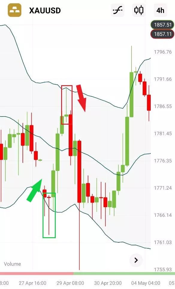
If a pin bar candlestick with a long lower shadow appears at the lower Bollinger band, open a Buy order above this candlestick. Put Take Profit at the middle/upper Bollinger Band and a Stop Loss below the pin bar’s minimum.

For a SELL order

If a pin bar candlestick with a long upper shadow appears at the upper Bollinger Band, open a Sell order below this candlestick. Put Take Profit at the middle/lower Bollinger Band and a Stop Loss above the pin bar’s maximum

You can use a 100-period Moving Average as a filter: consider only BUY trades when the price is above this line and only SELL trades when the price is below this line.  


Strategy #2 Squeeze strategy

The strategy is built on the idea that after the market calms down, there will be a spike in volatility and a breakout.

  1. Find a situation on the chart when the price moves in a very narrow range (Bollinger bands move close together).
  2. Buy on the breakout above the upper Bollinger Band and sell on the breakout below the lower Bollinger Band.
  3. Put the Stop Loss outside the consolidation range on the opposite side of the breakout.


Conclusion

The Bollinger bands indicator is a very useful technical tool that can form a solid basis for a very good trading system. It provides dynamic support and resistance levels and visualizes the level of volatility. Take your time to master this tool!

Awesome Oscillator

An indicator that is called “Awesome Oscillator” can’t disappoint traders. Learn how to use this tool correctly!


Awesome Oscillator in MetaTrader

Awesome Oscillator (AO) is another indicator developed by Bill Williams. To add it to your chart in Metatrader, click “Insert”, choose “Indicators”, "Bill Williams" and then “Awesome Oscillator”.

The main task of the Awesome Oscillator is to measure the dynamics of momentum. To be precise, it compares momentum for the last 5 candlesticks with the momentum of the last 34 candlesticks at a bigger timeframe. The value of the Awesome Oscillator indicator is calculated as the difference between moving averages over these timeframes. The Simple Moving Averages that are used are not calculated using closing price but using midpoints of each candlestick.

As the parameters of the indicator are specific, you don’t need to fill in any settings, you can only adjust its color scheme.


How to trade using Awesome Oscillator

The Awesome Oscillator provides several types of signals by helping to predict reversals and corrections of the price.

First of all, the indicator fluctuates around the zero line. If it rises above 0, the signal is bullish. If AO drops below 0, the signal is bearish.


Secondly, if Awesome Oscillator has formed two highs above 0 and the trough between them is also above 0, it’s a bearish signal. The second peak must be lower (closer to 0) than the first one and should be followed by a red bearish bar. Same way, if Awesome Oscillator has formed two lows below 0 and the trough between them is also below 0, it’s a bullish signal. The second peak must be higher (closer to 0) than the first one and should be followed by a green bullish bar.

The third signal is called a “saucer”. It’s a pattern made of the indicator’s 3 bars. A bullish saucer consists of a red bar, followed by a smaller red bar, followed by a green bar. All the bars should be above 0. A bearish saucer consists of a green bar, followed by a smaller green bar, followed by a red bar — all of them should be below 0.


Confirmation

The Awesome Oscillator produces a lot of signals. It’s natural that not all of them work. A bullish signal of the indicator means that the price is likely to go up but the probability of that is not 100%. That’s why we recommend using other tools of technical analysis to combine with the Awesome Oscillator and design a good trading system.  

Saturday, January 23, 2021

Stochastic Oscillator

The Stochastic indicator developed by George C. Lane at the end of the 1950s and is actively used among traders all over the world ever since. It evaluates the market’s momentum and compares the closing price to a price over a certain period of time. The idea behind the indicator is that in bullish market prices will close near the high, and in a bearish market prices close near the low.

The Stochastics can show when the asset you trade is overbought or oversold. It signals when the market’s momentum is slowing down. This, in turn, means that a change in trend is likely. As a result, the observation of the indicator may provide you with trade signals and ideas.


How to implement indicator

The Stochastics is included in the default set of MetaTrader. You can add it to the chart by clicking “Insert” – “Indicators” – “Oscillators” and then choosing “Stochastic Oscillator”.


The Stochastic Oscillator can be used on all timeframes. The default settings are 5, 3, 3. Other commonly used settings for Stochastics include 14, 3, 3 and 21, 5, 5. Stochastics is often referred to as Fast Stochastics with a setting of 5, 4, Slow Stochastics with a setting of 14, 3 and Full Stochastics with the settings of 14, 3, 3.

Fast Stochastics responds more quickly to the changes in the market price, while Slow Stochastics reduces the number of false crossovers and thus filters out some of the false signals. It’s up to you to choose the parameters you want.


How to trade using Stochastic

The Stochastic is measured in % from 0 to 100. The indicator is represented by 2 lines: the fast one, also called %K (solid green line) and the slow one, which is referred to as %D (red dashed line). Line %D is the moving average of %K.

These lines intersect when momentum changes. The signal is to buy when % K (green) crosses % D (red) from the bottom up. Sell when % K crosses % D top down.

Like any other indicator, the Stochastics doesn’t give the signals that are 100% profitable. There are 2 ways to make the signals of this indicator more precise:

1. Use the signals generated when the crossover happens in the extreme area (above 80 for sell signal and below 20 for buy signal).


2. Take into account the trend on a larger timeframe and trade in line with it. For example, if you use Stochastic on H1, check the trend on H4. If there’s a strong uptrend, don’t take the sell signals as the price may stay in the overbought area for extended periods of time. Instead, focus on the buy signals generated by Stochastics and you will have the benefits of trend trading.


In additions, as with other oscillators, pay attention to the situations when the Stochastic Oscillator is in divergence with the price chart. A sell signal occurs when the price makes a higher high but the Stochastic forms a lower high (bearish divergence). A buy signal appears when the new low of the price is not confirmed by the oscillator. 


It’s also recommended to use the Stochastic Oscillator in combination with other tools of technical analysis, such as Moving Averages, Heiken Ashi, Alligator, etc.


Conclusion

The Stochastic Oscillator is a powerful tool of technical analysis. It has several purposes and can be the basis of a good trading system.

Moving Average Convergence/Divergence

The MACD is one of the most potent technical tools in the arsenal of many traders. The indicator is used to check the strength and the direction of a trend as well as to define reversal points.

The MACD stands for the Moving Average Convergence Divergence and shows the relationship of the price’s two Moving Averages.

How to implement MACD

MACD is included in MetaTrader default indicator kit, so you don’t need to download it. Go to “Insert”, find “Indicators” and then “Oscillators” – and you will see the MACD. The indicator will appear in a  separate window below the price chart.

The classic settings include 12 and 26 EMAs and a signal line (SMA) with a period of 9. You can choose other parameters depending on your trading style and goals. For example, the MACD (5,35,5) is more sensitive and might be better suited for weekly charts.

Increasing the number of periods for the signal line will reduce the number of crossover signals, helping avoid false signals. However, trade signals will occur later than they would with a shorter signal line EMA.

The indicator can be applied to any timeframe, but it’s preferable to choose those from H1 and bigger.

How the MACD indicator works

The main idea behind the MACD is that it subtracts the longer-term moving average from the shorter-term moving average. This way it turns a trend-following indicator into the momentum one and combines the features of both.

The MACD has no bounds, but it has a zero mean, around which it tends to oscillate as the moving averages converge, intersect and diverge.

Convergence occurs when the moving averages move towards each other. Divergence takes place when the moving averages move away from each other. The MACD histogram is above 0 when the 12-period MA is above the 26-period MA and below 0 when the shorter MA is below the longer MA. As a result, positive values of the histogram point at a bullish trend, while negative values mean a downtrend.


How to use MACD in Forex trading

All in all, the market is bullish when the MACD is above 0 and bearish when it’s below 0.

The MACD provides traders with several types of signals: signal line crossovers, overbought/oversold levels, centerline crossovers, as well as divergences.

1. Signal line crossovers

A bullish crossover happens when the MACD starts rising and then goes above the signal line. A bearish crossover happens when the MACD starts declining and crosses the signal line to the downside.

The MACD works best in trends when the price range in rather narrow. A good strategy may be to establish a trend and then to use only those MACD signals which are in line with this trend.

On the picture below, you can see that in a downtrend it’s wise to trade only negative MACD crossovers with the signal line.


2. Overbought/oversold levels

It’s also possible to use the MACD as an oscillator. It’s common knowledge that the market always returns to the mean and the fast MA always returns to the slow one. The bigger the divergence between the Moving Averages (the higher of the lower is the MACD histogram), the more bullish/bearish the market is and the higher the probability of the price correction that will lead the MACD back to 0.

As a result, it’s possible to trade extreme highs/lows of the MACD as a sign that the market is overbought/oversold. As the indicator has no upper or lower limits, you should judge extremes by the visual comparison of the MACD levels. Notice that this kind of signals requires confirmation from price action or other technical indicators.

3. Zero line crossovers

A bullish zero line crossover occurs when the MACD moves above 0 to turn positive. It can be used as a confirmation of an uptrend. A bearish zero line crossover takes place when the MACD gets below 0 to turn negative. This can be used to confirm a downtrend.

Here the MACD gives trading signals similar to a two moving average system. One of the strategies is to buy when the MACD rises above the zero line (holding the position until the price returns below 0) and sell when the MACD crosses below the zero line (and closing the trade when the price gets back above 0). However, this approach is profitable only when strong trends emerge. During the volatile sideways market, this may result in losing trades.


4. Divergences

In addition, pay attention to divergence/convergence between the indicator and the price. Bullish convergence is formed, when the price sets lower lows, while the minimums of the MACD histogram get higher (buy signal). Bearish divergence is formed, when the price renews highs, while the MACD maximums become lower (sell signal).


Advantages and disadvantages

One of the biggest advantages of the MACD is that it’s both a trend and momentum indicator. However, like all other technical indicators, the MACD isn’t perfect. Its main flaw is that it gives the signals later than the price action itself. In addition, the MACD doesn’t provide ready-to-use stop loss or take profit levels.

Conclusion

The MACD is a very useful technical indicator. It produces a variety of signals and can represent a solid foundation of a trading system. To filter out false signals, use the MACD in combination with other tools of technical analysis. For example Envelopes and ADX indicator


Moving Average

Moving Average is one of the widely used indicators in trading. Traders love it because of its simplicity and effectiveness.  

In this article, we will explain what this indicator is and how to use it to lift your profit.

Moving average is the trend indicator. It takes average price figures and as a result, smooth price actions from fluctuations.


Types of Moving Average

There are 4 main types of the Moving Average that you can implement in MetaTrader. We won’t give you complicated formulas. It’s more important for you to understand the idea of each type.


Simple Moving Average

Usually, traders use the Simple Moving Average. This type of the MAs shows the average of close prices for the period it considers. As a result, all prices are equal in value.For example, if we have 10-day MA, we calculate a sum of 10 close prices and divide it in 10. Every time a new close price forms, the oldest one isn’t counted anymore.


Exponential MA and Linear Weighted MA

Exponential MA and Linear Weighted MA are quite similar. They calculate the latest prices with the higher coefficient. As a result, these MAs reflect price’s moves the most and gives signals faster. Be careful! These MAs give fast signals but some of them may be fake.


Smoothed MA

Smoothed MA is based on the Simple MA. It’s easy to define its major function after the first glance at its name. This MA clears price moves from fluctuations the most. This MA is the best to define the trend.


How to implement in MetaTrader

MA is set in MetaTrader, so you don’t need to download it. Go to “insert” – find “indicators” – go to “trend” – and you will see the Moving Average. It’s more important to apply correct settings.


Period

A period is the number of candlesticks that will be taken into consideration for calculating. The bigger period is, the smoother MA and more accurate signals will be. The smaller the period, the closer the MA will be to the price.


There is no single rule what period of the MA to use. Analyzing charts with big timeframes, traders prefer MAs with such periods as 50, 100, and 200. To trade on smaller timeframes, investors prefer small periods such as 9, 12, and 26.


Price

There are several options. It can be close, open, high, low, median, typical and weighed close prices. However, usually, traders use the close price.


Shift

This setting is used to pull the indicator forth and back in time. As a result, the MA will move up or down.


How to use Moving Averages in Forex trading

One thing we need to tell you. MAs give delayed signals because they calculate the last close price. Take it into consideration while using them in your trading.

1. MA is a trend indicator, so we will start with a trend detection. If you want to find out whether the market is bearish or bullish, a cross will help you.


Golden cross

When an MA with a smaller period crosses an MA with a bigger period bottom up, it’s a signal to buy.


Dead cross

When an MA with a smaller period crosses an MA with a bigger period upside down, it’s a signal to sell.


2.More about the trend function. If the indicator goes down, it’s a downtrend. If the MA goes up, it’s an uptrend.

3.Moving Average is highly used as support and resistance levels. The strength of the levels depends on the period of the MA. The bigger the period, the stronger the support/resistance. The timeframe plays an important role as well. The bigger the timeframe, the stronger the MAs will be. If you compare the 200-hour MA to 200-day MA, the last one will be a stronger level and as a result, more likely the price will fluctuate near it.

Using MAs as support and resistance levels, we get a chance to determine levels to open a position.


When the price breaks above the MA, it may be a signal to buy. Vice versa, a breakthrough below the MA will give a sign to sell. 

Tip: if the price hits the MA several times, it means that a reversal is close.


MAs and other indicators

A great advantage of MAs is that they are not the only indicator; they are a part of other technical indicators. The most famous indicator based on MAs is MACD. You can also find MAs in such trading tools as Alligator, Bollinger Bands, Ichimoku Kinko Hyo.

We always remind traders that there is no perfect indicator that’s why it’s important to combine them to get stronger signals.


What indicators are the best in a combination with MAs?

It’s always a good idea to use candlesticks. They give strong signals of a reversal and a continuation of the trend. Other indicators that can be used are oscillators.


Remember that you need at least 2 matched signals, to start trading

In brief: let’s generalize what you read above. Moving Average is the trend technical indicator that reflects price moves. It gives delayed signals, however, still is very useful as signals are strong. Buy when the price is above the MA and when you see a golden cross. Sell when the price is below the MA and you come across a dead cross.


Interesting Link about MA

Thursday, January 21, 2021

Relative Strength Index

Relative Strength Index, or RSI, is one of the most popular technical indicators among traders. It was developed by J. Welles Wilder in 1978 to measure the speed and the change of price movements. The indicator also helps to determine the overbought/oversold state of the market in order to buy low and sell high.


How to interpret Relative Strength Index:

The readings of the indicator fluctuate between 0 and 100. You can also add a middle line at 50. If the RSI is above this point, momentum is considered up and there’s more sense to look for opportunities to buy. When the RSI drops below 50, it’s a sign of a new bearish market trend, so consider opening sell trades.


The market is overbought or oversold

Like other oscillators, the RSI helps to tell when the asset is overbought or oversold. For the RSI, you need to watch the levels of 70 and 30. If the RSI rises above 70 bound, it means that the market is overbought and may correct down. If the RSI falls below the 30 line – the asset is oversold and may retrace to higher levels.


Notice, however, that this approach is not suitable for trading in strong trends when the RSI may stay overbought or oversold for long periods of time. If you have evidence that there’s a strong trend in the market, consider selling when RSI is oversold in a downtrend, and buying when RSI is overbought in an uptrend.


All in all, the quality of RSI signals increases when you follow only those signals that are in the direction of the trend when the indicator leaves critical levels. For example, you can buy during an uptrend when RSI gets above 30.


The market reversal

Moreover, the divergence between RSI and price may warn of the market reversal. When the new high of the price is not confirmed by the new high in the RSI, it’s a bearish divergence, which is a negative signal. When the price forms a lower low but the minimum of RSI is higher than the previous one, it’s a divergence in favor of bulls.


The RSI is often used in combination with another oscillator, the MACD. While the RSI measures price change in relation to recent price highs and lows, the MACD measures the relationship between two EMAs. Together the RSI and the MACD represent a powerful combo.


Build your strategy on RSI::

Before we consider RSI trading strategies, it’s worth beginning with the small definition of the RSI.

RSI (Relative Strength Index) is one of the oscillator indicators that is widely used by traders to determine reversal points. The main idea that you should keep in mind implementing different trading strategies is “if RSI rises above 70 bound, it means that the pair is overbought. If RSI falls below the 30 line – the pair is oversold.”

Let’s consider 2 simple trading strategies that you can use in your daily trading.

Strategy #1


Criteria:
  • Currency pair – any
  • Timeframe – H4
  • RSI – Period 8, apply to “Close”, levels: 30, 40, 50, 60, 70

BUY Steps:


  1. When RSI crosses the 50 level bottom up, place Buy Stop pending order 15 pips above the candlestick where the cross happened. Don’t forget about Stop Loss! Place it at the local minimum. And remember that if the index crossed the 50 level back, you should close the position.
  2. As soon as the index crosses the 60 level, place the second order. The Stop Loss should be placed at the local minimum as well.
  3. When is it time to close the position? As soon as the RSI breaks the 70 level upside down.

SELL Steps:


When RSI crosses the 60 level downside, place a Sell Stop pending order 15 pips below the candlestick where the cross happened. The Stop Loss will be at the local high.
When the index breaks below the 50 level, place another pending order below the candlestick of the cross. Don’t forget about the Stop Loss.
If you come back to the introduction of this article, you will see that 30 line is one of the key levels. So when the index crosses the 30 level bottom up, it’s time to take profit as it’s a signal of the reversal up.
Strategy #2 (the 50th candlestick)

Criteria:

  • Currency pair – any
  • Timeframe – any
  • RSI - Period 8, levels: 20, 80

Steps:

  1. Find a pair the 50th candlestick of that is lower than previous 49 ones.
  2. Apply the RSI indicator. Check where the indicator crosses the 20 level upside down. Check whether the below 20 RSI corresponds to the 50th Only after both conditions are met, you can move to the next step.
  3. Now it’s time to wait for another candlestick that will be lower than the 50th However, it’s important to have a look at the index. The index is supposed to provide a higher signal than the first one (it’s a divergence between the indicator and the price). If these conditions are met as well, we can look for the entry point.
  4. The next step is to determine the entry. You should wait for the candlestick that will close above the 50th After that, you can open the position.
  5. The next step is very important in any trade. Place the Stop Loss. Have a look at the chart and find a reasonable support level according to the previous price moves. Your Stop Loss should be a little bit lower than the support because the price may reach the support and rebound. But if it doesn’t rebound, risks of the further fall would increase.
  6. The last step is to find a take profit level. It’s a golden rule of traders to use 1:3 risk-reward ratio. So if you determined the Stop Loss level, you should count the distance between the entry price and the Stop Loss and place 3 such distances above the entry price. It will be your target.


Tips: all traders know that signals of only one indicator don’t give 100% assurance. It’s always better to combine several indicators. And if you see that another indicator signals the reversal, it’s better to take that signal into consideration and maybe even close the position before the RSI gives a signal.

Making a conclusion, we can say that RSI is one of the most reliable indicators. You even may combine it with other indicators to create your own strategy!


Conclusion

A competent trader should know what the RSI is and how to use it. Make sure that your analysis isn’t built solely on RSI but comprises the study of price action as well as other technical indicators. Remember that the signals of the Relative Strength Index are most reliable when they conform to the long-term trend.


Thursday, January 14, 2021

Pivot Points

We all had this problem when it was hard to define the target levels for the price. Usually, the choice of support and resistance levels has a lot of subjectivity involved. That is why many traders use indicators to determine more universal target levels. One of the simplest ways to do that is to use Pivot points.


What are Pivot Points?

Pivot points are significant support and resistance levels, which can define potential trades. They were calculated by professional floor traders (exchange members who execute transactions from the floor of the exchange, exclusively for their own account) to set the key levels. These traders used to adapt rapidly to the short-term changes in the market.


At the beginning of the trading session, they looked at the previous day’s high, low and the closing price to calculate a pivot point for the current trading day. Afterward, support 1, support 2, resistance 1 and resistance 2 were calculated. The levels were used for the daily trading. This is known as a traditional 5-point system. 


There are different ways to calculate pivot points

Let’s start with the classics.


The main pivot point (PP) is the central pivot. The central pivot is the main support/resistance. This means the price is expected to float around this level most of the time.  It is used as the base for all other pivot levels.  


Сlassical formulas

The pivot point is calculated as follows:

Pivot Point (PP) = (High + Low + Close)/3

The rule behind this calculation is simple: we take yesterday’s high, low and close price and divide it by 3.

Support 1 (S1) = (PP x 2) – Previous High;

Support 2 (S2) = PP – (Previous High – Previous Low);

Resistance 1 (R1) = (PP x 2) – Previous Low;

Resistance 2 (R2) = PP + (Previous High – Previous Low).


Sometimes the opening price is also used in the formula. In that case, the equation is:

PP = ((Today’s Open) + Yesterday's (High + Low + Close)) / 4

The levels of support and resistance are calculated the same as in the 5-point system.

The classic 5-point system is not the only way of calculating Pivot points.

Let’s look at the other types.


Woodie Pivot Point formulas

Some traders use Pivots based on Woodie formulas. They are calculated very differently:

R2 = PP + High – Low

R1 = (2 X PP) – Low

PP = (High + Low + 2Close) / 4

S1 = (2 X PP) – High

S2 = PP – High + Low

Some traders prefer them as they give more weight to the closing price of the previous period.


Camarilla Pivot Point

These levels are similar to the Woodie, although they are calculated for 8 major levels (4 resistance and 4 support).

R4 = C + ((H-L) x 1.5000)

R3 = C + ((H-L) x 1.2500)

R2 = C + ((H-L) x 1.1666)

R1 = C + ((H-L) x 1.0833)

PP = (H + L + C) / 3

S1 = C – ((H-L) x 1.0833)

S2 = C – ((H-L) x 1.1666)

S3 = C – ((H-L) x 1.2500)

S4 = C – ((H-L) x 1.5000)


Fibonacci Pivot Point

The main point of this type is the usage of Fibonacci levels in calculating the supports and resistances.

R3 = PP + ((High – Low) x 1.000)

R2 = PP + ((High – Low) x 0.618)

R1 = PP + ((High – Low) x 0.382)

PP = (H + L + C) / 3

S1 = PP – ((High – Low) x 0.382)

S2 = PP – ((High – Low) x 0.618)

S3 = PP – ((High – Low) x 1.000)


The choice of periods depend on your trading strategy

Pivot points levels change depending on the period you choose. There are daily, weekly, monthly and yearly pivot points.

Usually, we use daily pivots for trading on the M30 and shorter intraday timeframes. They use the previous day’s high, low and close. The figures update every day.

We use the weekly pivot points on H1, H4, D1 charts. To calculate these levels, the previous week’s high, low and close are used. Take a note that they do not change until the next week starts.

On the weekly charts, we recommend you to use monthly pivots. They gather the data from the previous month.

In case you analyze the monthly chart, it is possible to apply the yearly pivots. It uses the high, low and close of the previous year.


The usage of pivot points

There are a lot of strategies of using pivot points by traders. Let’s look at the most frequently used.


Support and resistance

  • Pivot points can be used as traditional support and resistance levels. Range-bound forex traders place a buy order near identified levels of support and a sell order when the pair near the resistance. The more times a currency pair touches a pivot level then reverses, the stronger the level is.
  • If price is moving towards the resistance level, you can place a sell limit pending order and a stop loss just above the resistance.
  • If the price is moving towards the support level, you could place a buy limit and a stop below the support.

Keep in mind, that support levels become resistances if the price is below them and resistances become supports if the price is above them.

Key levels

Breakout forex traders use pivot points to identify the key levels that need to be broken to determine a further direction of the price.

  • If you believe that you see a strong bullish trend, you can wait until the pair breaks the first resistance. As soon as the pair broke it, you can open a buy position and place a take profit at the level of the next resistance. Don’t forget about the stop loss. The stop loss should be placed below the first resistance. However, you can move your stop loss manually if you see that the price keeps rising.
  • If you see that price broke the support, you can start selling the pair. The take profit will lie at the level of the next support, stop loss should be placed above the support the pair has broken. You can move your stop loss here too if you see a continuation of the downward movement.

Be careful with this strategy as it is hard to define whether it’s a breakout or fakeout. Spikes are a common occurrence during news events, so be sure to keep up with breaking news and be aware of what’s in the economic calendar for the day or week.

Market Trend

Pivots may be used to identify the overall market trend.

If the price breaks through the pivot point to the top, it’s a sign that there are a lot of buyers on the market and you should start buying the pair. The price being below the pivot point would signal bearish sentiment and that sellers could have the upper hand for the trading session.

Market sessions

Another important thing to know is connected with the market opening hours.

As we know, the Forex market is functioning 24 hours a day. There are four market sessions: Australian, Japanese, UK and USA. You can find the approximate time for each of them Time of trading sessions.

When one of the markets opens, there is a high possibility of breaking the pivot levels as a lot of traders enter the market at the same time. During the period when the US market is closed and the Asian market opens, prices may remain stable for hours between the pivot point and either support or resistance. This gives opportunities to range-bound traders.

To conclude, the pivot points are helpful for trader in different ways. You can use them on their own or in combination with other indicators. The second option allows you to create and practice your own unique trading strategy. 


Other interesting video: How oscillators work?

Support and resistance

The concept of support and resistance is very important for traders. Basically support and resistance represent areas where the price action is expected to face obstacles. Let’s study this in detail.  

Support is a price level where the falling price tends to slow down or reverse. This means the price is more likely to "bounce" off this level rather than break through it. However, once the price has passed this level, it is likely to continue dropping until it finds another support level.

Resistance is a price level where the rising price tends to slow down or reverse. The price is more likely to bounce back from this level rather than break through it. However, a break above this level opens the way for further price growth until it finds another resistance level.


How to use S&R in trading

Support and resistance allow traders to guide themselves through the market. Once you mark these levels on the chart, you will see the structure of the market and be able to predict the direction of the price’s next steps as well as their size.

The idea is that these levels will most likely stop the price action and make it reverse. As a result, it’s a common approach to open buy trades at support and sell trades at resistance. If you want to get the benefit of trading a trend, then you will buy at support during an uptrend or sell at resistance in a downtrend. If you don’t trade trends, then you still can use support and resistance levels as your entry points and close positions at the next support/resistance levels.

Indeed, S&R levels also give a trader a hint where to close a trade. Thus, if you have an open selling position and the price is approaching a support level, you might think about closing your trade. The same thing is with a buy trade, the difference being that after you opened a buying position you need to mind resistance levels.

Support and resistance can be located on every timeframe. Yet, keep in mind that the bigger the timeframe, the more important is a support/resistance level. In addition, despite the fact that we talk about levels here, trading is not a precise science, so you actually need to think about S&R as areas. When you’ve identified support or resistance, you need to include a couple of pips around it. This will help you make your trading more accurate.  


How to locate support and resistance?


Support and resistance come in different forms. Firstly, there are the diagonal trendlines we explained before. A trendline can connect the price’s highs and limit the trend on the upside. In this case, this trendline is called a resistance line. A trendline can also be drawn through the lows of the price chart and limit the price action on the downside. Such a line is called a support line. Support and resistance lines can be drawn in both uptrends and downtrends. You need at least 2 highs or 2 lows to draw a trendline through them. You can find more information about drawing trendlines. 

Notice that during an uptrend, support line is the most important one because if the price breaks below it, the trend will change to a downtrend. During a downtrend, resistance line is the key one as a break above it would mean a reversal up.


As the market is constantly moving, it often happens that support and resistance lines and levels switch places. As you can see at the picture above, after the price fell below the support line it started to act as a resistance line.

There are also horizontal support and resistance levels. One of the simplest and most effective ways is to draw them through the previous highs and lows of the price chart:


Other techniques traders use to identify support and resistance levels are moving averages, Fibonacci levels, pivot points, etc.

Types of trend

A trend is the general direction of the price of an asset on the market. If you look at a chart of any financial instrument, you will see that prices never move in straight lines, they are constituted of a series of highs and lows. More often than not a price has an upward or downward bias.


Types of trend

There are three types of trends:

1#Uptrend (bullish trend) consists of a series of higher highs and higher lows (prices are moving up). One may speak about an uptrend if there is a clear support line, connecting at least two lows and limiting the downside. A break below this line signals trend's weakness or reversal.


2#Downtrend (bearish trend) is classified as a series of lower lows and lower highs (prices are moving down). A downtrend can be defined if there is a clear resistance line, connecting at least two highs and limiting the upside. A break below this line signals trend's weakness or reversal.


3#Sideways (flat, horizontal) trend – there is no well-defined trend in either direction.


In terms of length, trends can be classified as:

Long-term (6 months – 2.5 years) – a major trend which can be traced on a weekly or monthly charts. It is composed of several medium-term and short-term trends, which often move against the direction of the major trend.

Medium-term (1 week – a couple of months) is better seen on the daily and H4 charts.

Short-term (less than a week) is better seen on hourly and minute charts.

Every trend consists of movements in the direction of this trend which are intermitted by counter-trend moves called “retracements” or “corrections”. A trend is expected to continue until a reversal takes place and the direction of a trend changes.


Trendline

A favorite saying of traders is “A trend is your friend”. The idea behind this phrase is that traders can make good profits by following a trend, i.e. trading in the direction of a trend (buying during an uptrend and selling during a downtrend).

In order to determine which trend is there at the market, traders draw trendlines and use technical indicators.

A trendline is a line drawn through pivot highs or pivot lows of the price chart to show the prevailing direction of price. As such line connects the already formed peaks and troughs of the price, it can be continued (projected) to the right of the current price. It’s assumed that this line will be an obstacle for the price in the future.


On the picture above you can see the trendline drawn through a price’s low and a higher low in an uptrend. The price respected the trendline for some time continuing moving within a rising trend. Then it broke below the trendline. This was a sign that the uptrend finished and the market reversed down. Those traders who opened buy trades during the uptrend closed their positions and opened sell trades.

Fundamental analysis & Technical analysis

Fundamental analysis


Fundamental analysis is a study of the underlying factors that drive the market. This type of analysis is based on economic data and news events.

When a trader builds a strategy, he/she takes into consideration the dynamics of such economic indicators as inflation, interest rates, retail sales, jobs data, etc. You will find all important data releases in the economic calendar

News events include announcements of central bank governors; discussions of intercountry issues


Key elements


A challenge of fundamental analysis is to learn how to interpret changes in economic data and speeches of authorities.

Remember though the key logical rule: a domestic currency will rise if a country’s economic data improves and beats expectations. 

As you trade currency pairs in which two currencies are involved, you use fundamental analysis to compare economies of these countries. Whichever is stronger, the currency of that will rise versus the other one


Technical analysis

Technical analysis (TA) is a method of predicting the future performance of an asset’s price on the basis of its historical performance.

In other words, technical analysts study financial charts in order to determine what will happen with the price next.

In contrast to fundamental analysis which is regarding the “value” of the asset, technical analysis is only interested in price, volume and other market information. Some traders use either technical or fundamental analysis, while others combine these two methods to make trading decisions.

TA is based on the Dow theory, which is an approach to chart analysis proposed by Charles Dow (1851–1902), co-founder of Dow Jones and Company and the first editor of The Wall Street Journal. The other great contribution to technical analysis comes from Japan, where a specific type of chart was used for tracking the price of rice since the 1600’s.


Technical analysis is based on three assumptions

1# The market discounts everything.Technical analysts think that the price of a financial asset already reflects all the relevant information about it including the various economic factors and market psychology. As a result, to make predictions about the future price it’s only needed to analyze the chart and nothing more.

2# Price moves in trends.According to technical analysts, the dynamics of a market has a certain rhythm, an order to it. The movement of prices has a bias (upward, downward, or sometimes horizontal) that is called a trend. It’s necessary to analyze the market specifically looking for trends. If there’s a trend, the price will more likely continue moving in line with it rather than change direction. This assumption forms the basis for many trading strategies.

3# History tends to repeat itself.It is believed that the past movements of the price get reproduced in the present and the future. It happens because traders tend to react to specific things they see on the charts in the same way for psychological and emotional reasons. It’s possible to identify specific patterns and expect that these patterns will occur in the future causing the same price action that they used to provoke in the past. The conclusion is that it’s necessary to study the chart history in order to be able to read the signs of the upcoming price moves.

Technical analysis involves the study of price action as well as the use of technical tools and indicators. The term “price action” refers to movements the price makes. Price action trading means that you take hints on whether to buy or sell based only on the price you see on a chart. Such method suggests that you are not using technical indicators or give them a very little weight in your decision making


Comparison of analysis types in the table


How to choose stocks?

  • P/E ratio simply shows how much investors are paying for a dollar of profits. Investors use this indicator to compare different stocks or even one stock with its historical record
  • Dividend yield: The company pays some percentage of the stock's value to its investors, which is called a dividend. The yield is the annual dividend payout divided by the stock price. If a company increases its dividend payouts every year, it’s a positive signal for investors as it shows its economic sustainability over some period of time. There are some companies in the S&P 500 that increase their dividends for 25 years in a row. They are called dividend aristocrats. Among them are Coca-Cola, McDonald’s, Procter & Gamble, etc.

Types of stocks

Growth stocks are those expected to grow faster than the rest of the stocks, and that’s why they are named so. Sometimes, they can be riskier but traders prefer choosing them because of greater potential in the end. Examples are Google and Amazon. They have never paid a dividend as these companies prefer using their available capital investing in internal businesses.

Income stocks are those that are not volatile but have a good background of paying higher dividends than other stocks. For example, AT&T, a giant telecom company.

Value stocks are those that are undervalued. They are trading at a lower price than their underlying companies are worthy of, according to investors/analysts. The trick is to find it faster than the rest of the investors! When others recognize its potential, the owner of such a stock would gain. Examples are General Motors and Ford.

Blue-chip stocks are those that have been rising for a long time and thus considered low-risk investments. However, they tend to increase the value slower than the growth stocks or pay as well as income stocks. Examples are Microsoft and Alibaba.

Defensive stocks are those in which companies offer such necessary products and services that people would buy no matter what. They include the stocks of food and beverage companies and pharmaceutical companies. A good example would be the giant retailer Walmart.

Cyclical stocks generally follow the economic cycle of growth and recession – they rise in times of economic expansion but fall during recessions and market instability. Cyclical stocks are usually the travel and hospitality industries, automakers, and banks.

Speculative stocks are usually young companies with revolutionary technologies or unique products. The performance of these stocks is hard to predict, and they are viewed as high-risk investments as high returns always go along with high risk.

How to create a stock portfolio?

Diversify
It is the most universal recommendation for stock investors. The idea behind diversification is not to put all the eggs in one basket – to collect a set of various stocks that will react differently during the same economic events. The goal is to minimize the risks of unexpected price movements of one asset. To diversify, you need to do the following things.
  1. Invest in different sectors. Try to choose the ones with a sustainable competitive advantage. For example, a healthcare stock, an auto stock, and a bank stock would be a perfect combo. Another way to diversify is between growth and value stocks; cyclical and defensive stocks.
  2. Buy both undervalued stocks with higher potential growth and decades-proven titans like Amazon or Google.
  3. Vary companies’ size and type.

Think long term
In the short term, the chosen stocks can fluctuate, drop during market shocks, but it’s necessary to stick to your long-term plan especially during a high-volatile market. 

Follow news and market trends
Be updated with the news of the stock market and experts’ opinions. For example, now the electric vehicles are on hype as Biden is planning to make the US carbon-free and analysts forecast the bright future for EV stocks. However, it’s not only Tesla, there are other stocks like Ford and General Motors which are trying to move from petrol to electricity and are also viewed as value stocks. Pay attention to both the overall stock market trends and to the news of the particular companies that you own or you’re interested in.


Featured Posts

Two Ways to Win in Trading

Two approaches to trading Forex trading is complex and challenging. Numerous and various market participants constantly contemplate how to ...